Brand Identity
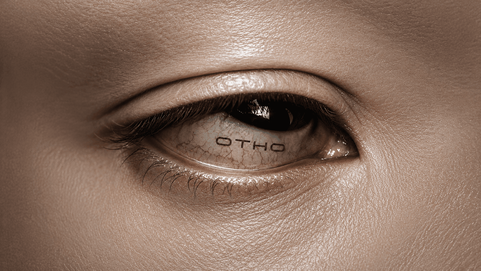

Ember is a fictional care label centred on protection, touch and the changing surface of skin. A close portrait holding a green tube and macro images of water on a leaf shaped the core idea: efficacy expressed through material detail rather than clinical distance.
The identity balances a concise wordmark with a photographic language of sheen, moisture and saturated colour. Deep red gives the portraiture warmth and focus; green introduces a botanical counterpoint without turning the system into a familiar natural-care code. Cropping stays close, allowing gesture, texture and product form to carry the story.
Otho defined a visual system for campaign stills, digital launches and product-led communication. Typography remains quiet around the images, while a small set of tonal contrasts creates continuity between skin, leaf and object. The concept is deliberately compact: each element has a clear role, and recognition comes from the relationship between colour, surface and controlled editorial framing.


CREDITS
Creative Direction — Sara Yan
Art Direction — Noah Smith
Motion Design — Mason Carter